


More Templates
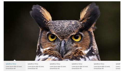
Slider with Horizontal Tabs
It considers one tab for each slide which it shows the tabs as thumbnails, you can put ...
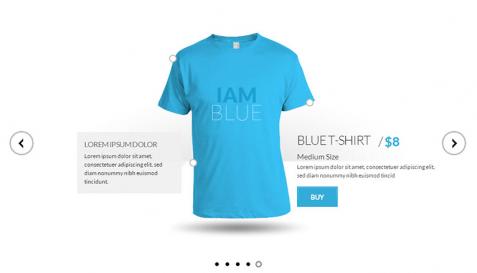
Showcase Version 1
It is suitable to show products. You can show different aspects of a product in multip ...

Flickr Plugin Sample
It dynamically loads images from your flickr account, you will be able to create a tou ...

Staff Carousel Version 5
It is perfect to show your staff information, it accepts slides in any size and each ...

Video Gallery With Vertical Thumbs
It is a perfect video gallery, accepts just any video size from Youtube or Vimeo and a ...

Slider with Lightbox and Fade Effect
You can attach one lightbox to each slide and it shows the related lightbox by clickin ...